
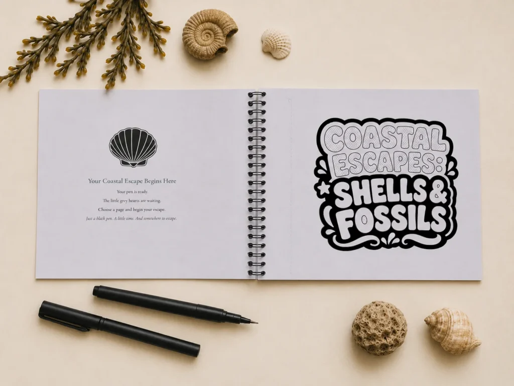
Monochrome colouring removes much of the uncertainty that can come with traditional colouring pages. With the black structure already doing much of the visual work, you can focus simply on the experience of colouring and watching the design take shape.
Less choice, more flow
There is no need to choose, compare or coordinate a large palette of colours. With that decision already made, it is easier to settle into the page and enjoy the rhythm of colouring.
Gentle guidance
The small hearts offer just enough direction without making the process feel complicated. They show which white spaces are yours to complete, so you can begin confidently and keep moving through the design.
A bold image taking shape
The contrast between the printed black structure and the newly coloured black areas gives each page its strong finished character. Every completed space changes the balance of the composition and brings the image more clearly into view.
One area at a time
Working gradually can be deeply satisfying. There is no need to complete a page in one sitting; each small area offers a natural stopping point, while every return reveals a little more of the artwork.
Detailed, but approachable
Some designs are expressive or intricate, but the clear monochrome structure and marked colourable spaces make them approachable. You can enjoy the detail without having to plan the finished result before you begin.